Assignment 1: August 18
We selected our signature from the signature sheet image and used the magic eraser to remove the background. Then we turned it into a brush and will use it on the bottom right corner of all future assignments.
Assignment 2: August 19-20
|
|
|
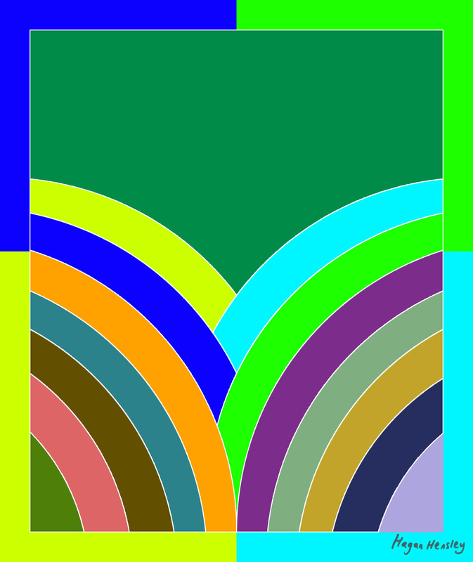
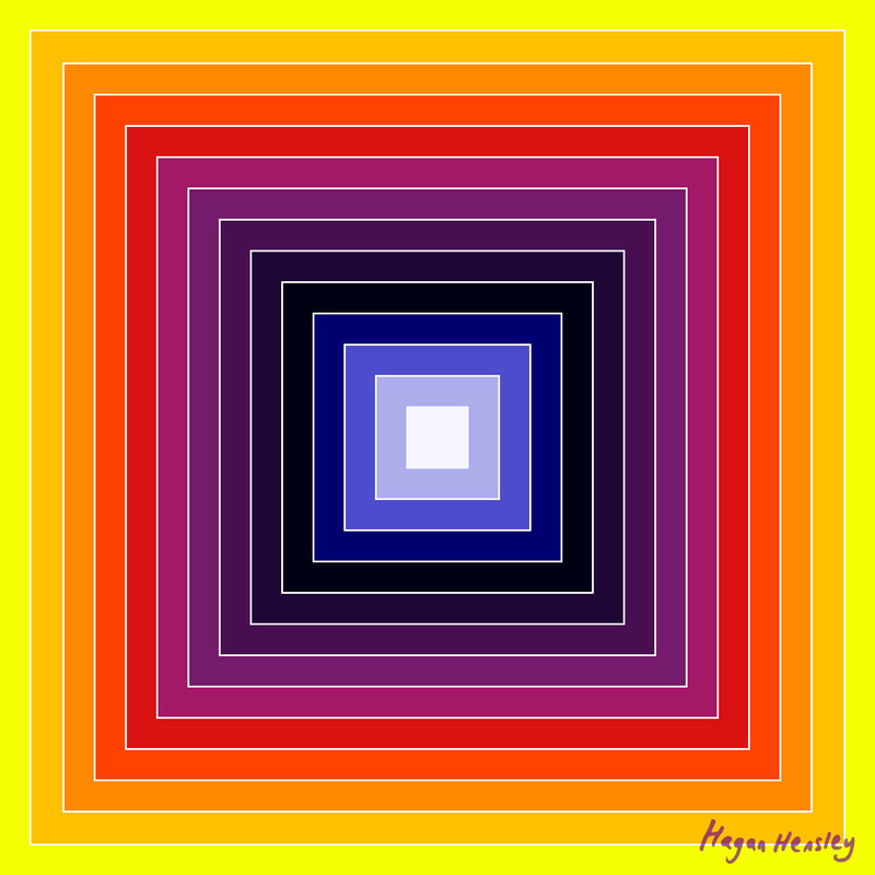
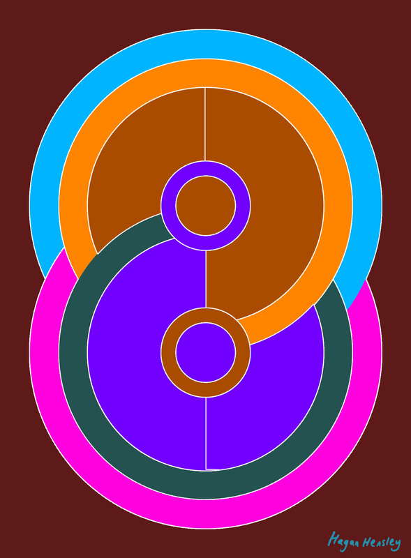
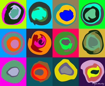
We created several layers (Ctrl-Alt-Shift-N), and placed a square or circle of different color on each layer using the rectangular/elliptical marquee (Left toolbar, second to top). We used the grid to make the squares/circles look more even (View>Show>Grid). We added a white stroke around each square/circle(Layer Style>Stroke>Color>(choose white)). We then put our custom signature brush in the lower right corner, as always.
Frank Stella was an American painter who created colorful geometric designs. They often included overlapping triangles and circles. Frank Stella was one of the first pioneers of modern art, beginning his career in the mid-50s. Stella also did some geometric sculptures. These assignments were based on Frank Stella's artwork.
Frank Stella was an American painter who created colorful geometric designs. They often included overlapping triangles and circles. Frank Stella was one of the first pioneers of modern art, beginning his career in the mid-50s. Stella also did some geometric sculptures. These assignments were based on Frank Stella's artwork.
Assignment 3: August 21, 2013
This assignment is based on the works of Wassily Kandinsky. We colored the background with 12 different colored squares, added circular patterns in a new layer atop each square, then used "Filter>Liquify" on the circles to make them look more paint-like.
Kandinsky was a Russian painter whose art consists of mostly abstract color designs. His art is like Frank Stella's but much more organic. I think it looks much better than Stella's.
Kandinsky was a Russian painter whose art consists of mostly abstract color designs. His art is like Frank Stella's but much more organic. I think it looks much better than Stella's.
Assignment 4: August 23, 2013
|
|
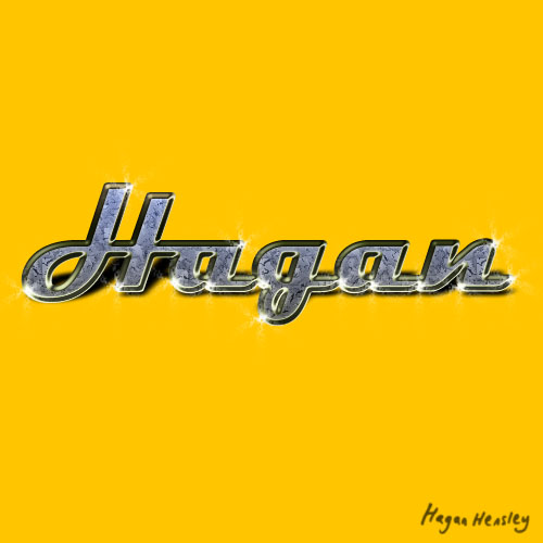
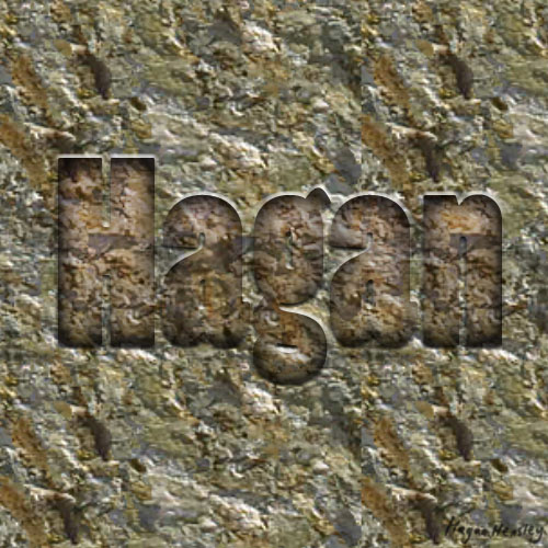
These projects involved the use of layer styles to make text look different. The one of the left is my name in bling, and the one on the right is a rock carving of my name. We had to rasterize the layer to add the effects.
Assignment 5: August 27, 2013
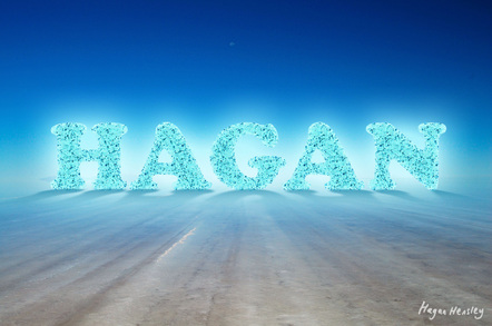
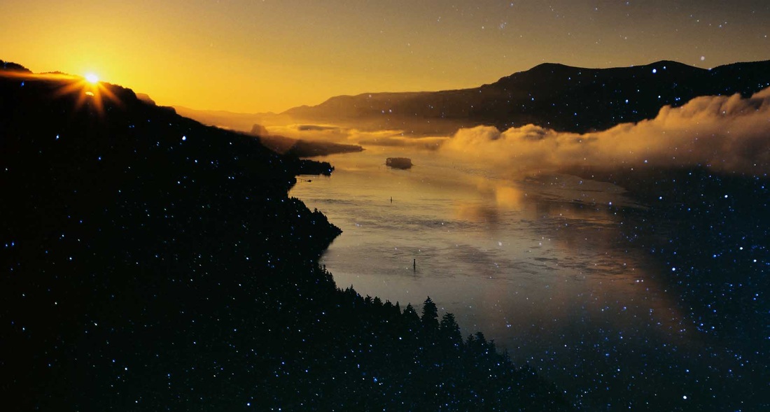
This is my name in big bold letters superimposed on an image of a large salt flat. This happens to be the largest reflective surface in the world. I added an outer glow and an inner glow to make it look like there were lights behind it, and a pattern overlay to add the texture. I also duplicated and warped the layer, removed the layer styles, and erased the bottom half to make the shadow.
|
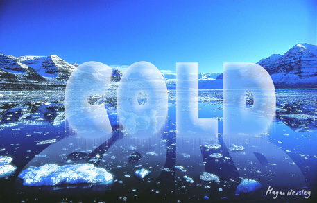
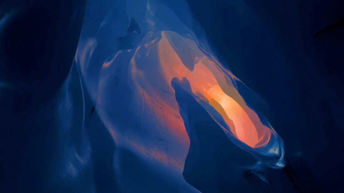
This is the word "COLD" superimposed on an image of freezing Arctic water. I used the Wind tool to make the icicles, as well as an inner glow and a bevel/emboss. I reduced the opacity of the layer to 70%. I then duplicated the layer, turned it over and warped it, removed all the layer styles, and erased the bottom half.
|
Assignment 6: August 28, 2013
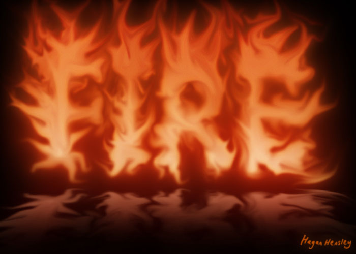
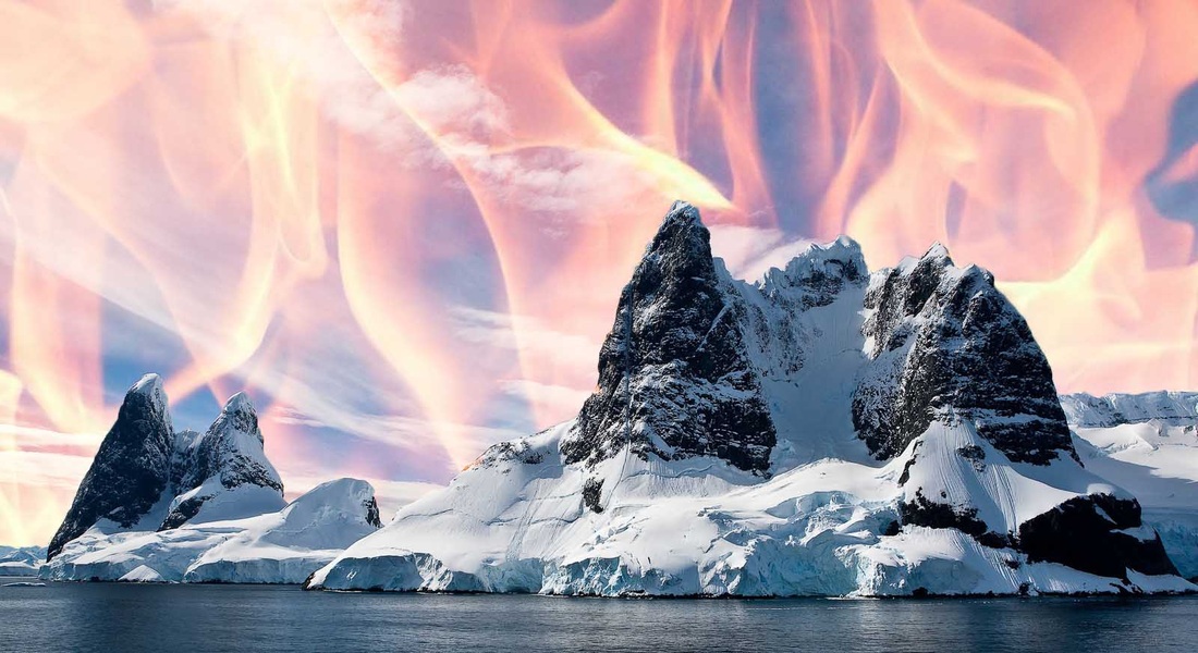
For this assignment, we wrote the word "FIRE" in a large, bold font. Then we smudged it with the Smudge tool too make it look like flames and we added an outer glow. We then changed the color using an adjustment layer. Next we duplicated the "FIRE" layer, stripped all the layer styles, and warped it into a reflection.
Assignment 7: August 29, 2013
For this assignment, we created several layers of fire using the Smudge tool to make the flames. Then we went to Window>Animation and made a frame for each layer. Then we tweened the frames together to make a smooth fire animation. We saved it for web and devices instead of saving it the normal way.
Assignment 8: September 3, 2013
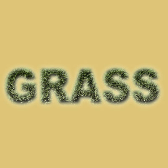
For this assignment, we created a sandy-colored background. We then added the word "GRASS" and applied various layer styles to it until it looked just like real grass. Next, we deleted it and recreated it from memory. We do these recreations often.
Assignment 9: September 5, 2013
We learned how to create an embroidered look using a work path. We made the pattern on a jersey with embroidered letters.
Assignment 10: September 17, 2013
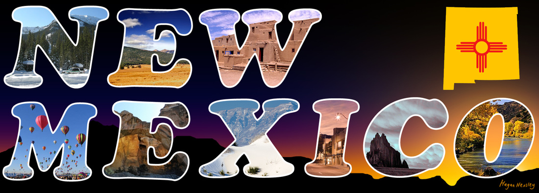
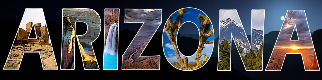
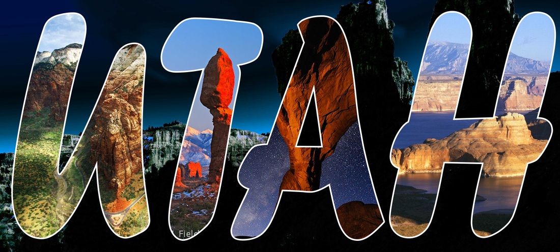
We used clipping masks to make a postcard effect. I chose a random state to make my postcard by closing my eyes and pointing at a map of the USA. I added a stroke around the letters and a landscape background.
Assignment 11: September 20, 2013
This assignment involved using clipping masks to put things together that don't belong.
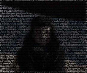
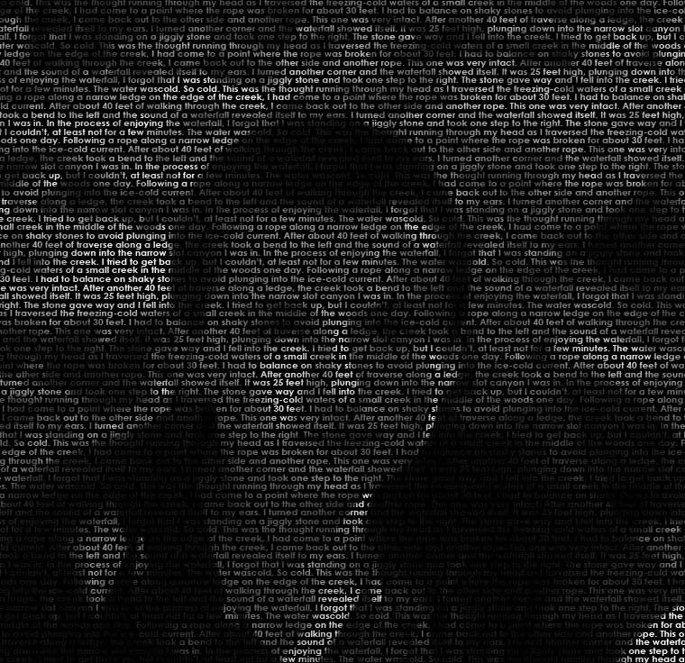
Assignment 12: September 26, 2013
|
|
|
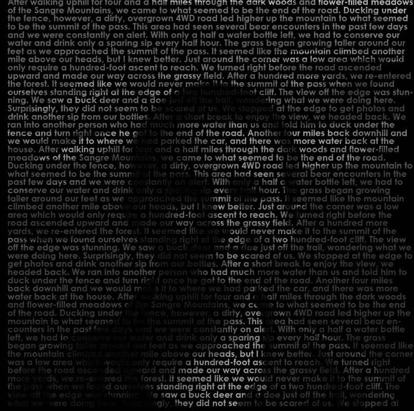
This assignment involved turning a large block of text into a portrait. My theme was pictures of me in the outdoors. I added a bit of color on one of them.
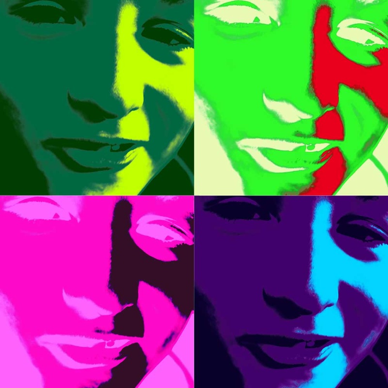
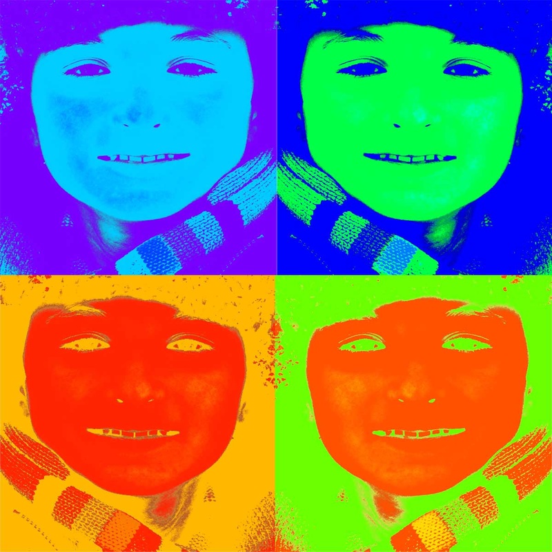
Assignment 13: September 27, 2013
|
|
|
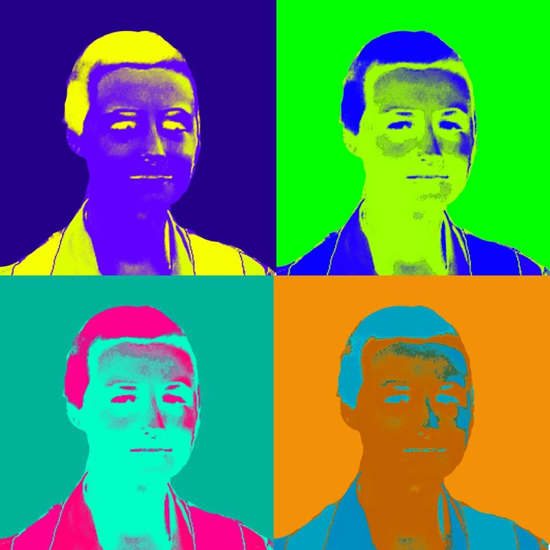
Andy Warhol pop art portraits.
Assignment 14: October 2, 2013
|
|
|
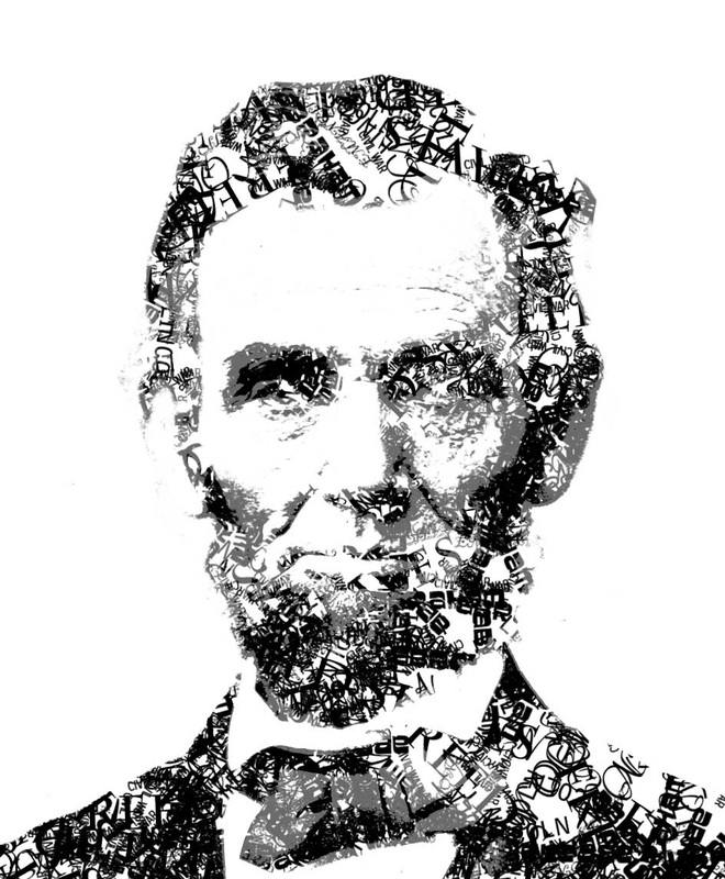
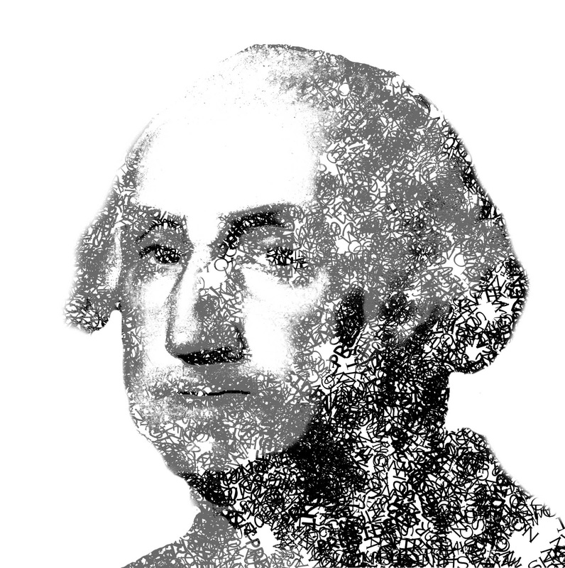
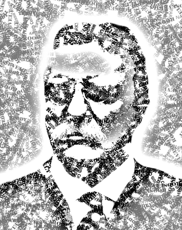
Text brush portraits of three presidents (all of whom happen to be on Mount Rushmore). Teddy Roosevelt has a high-pass filter applied to the layer mask.
Assignment 15: October 7, 2013
|
|
|
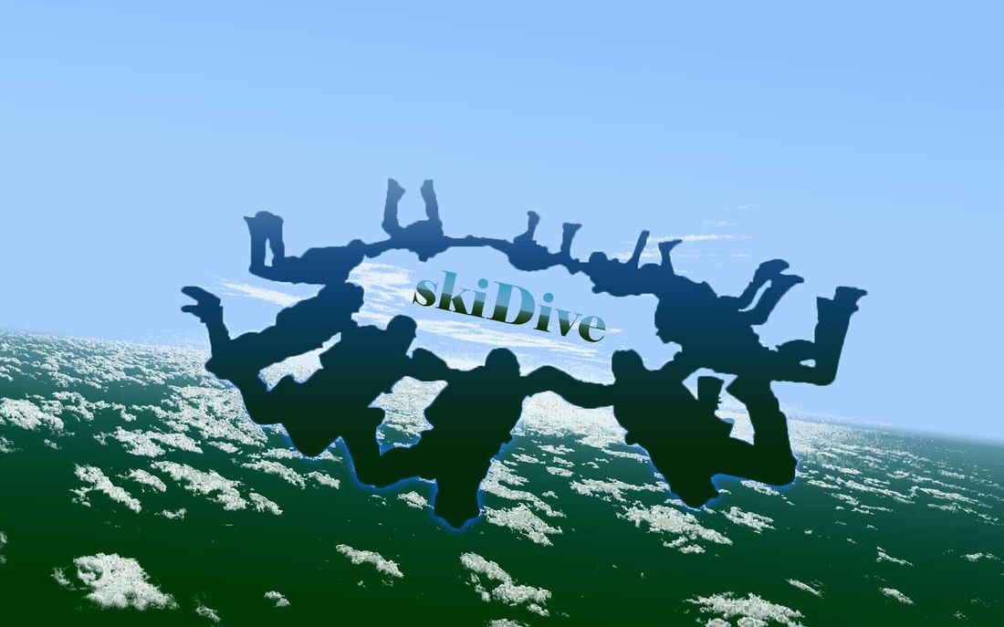
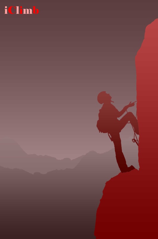
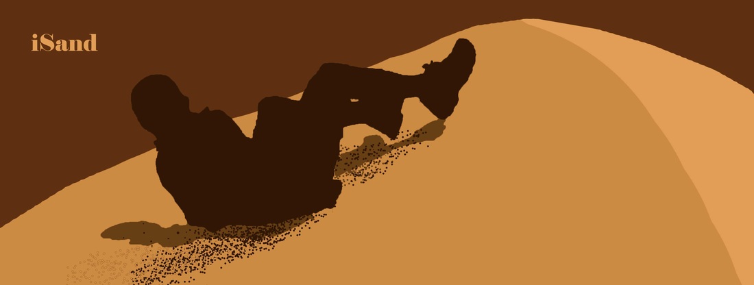
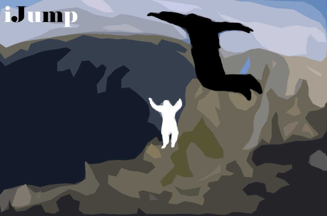
This assignment was based on the iPod silhouette ad. We made silhouettes of three things, and one of ourselves. I used a theme of outdoor adventure.
Also, I can't spell "silhouette" without looking it up.
Also, I can't spell "silhouette" without looking it up.
Assignment 16: October 28, 2013
(We took a while to do some art history timeline things, and we now are doing Halloween-themed designs.)
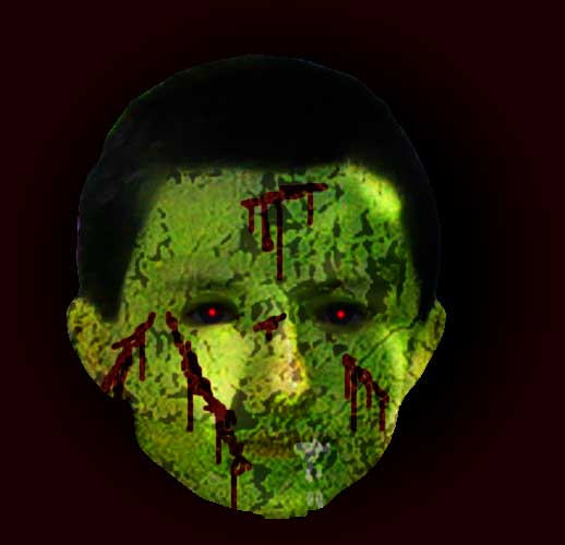
My face as a zombie, just in time for Halloween. (See that it's drooling?)
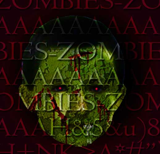
And here with a slightly more apocalyptic twist. I know I look more like a troll than a zombie.
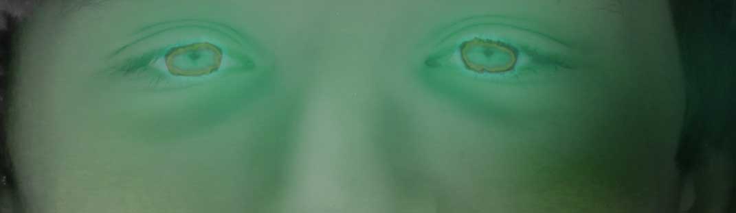
Assignment 17: Creepy Eyes
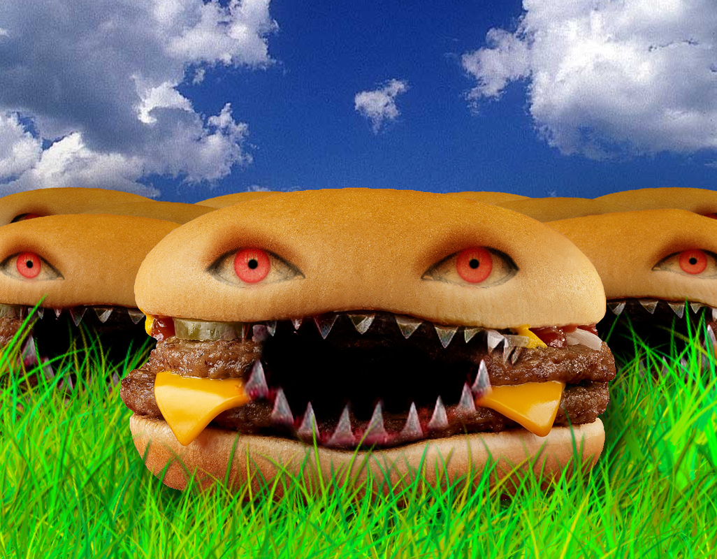
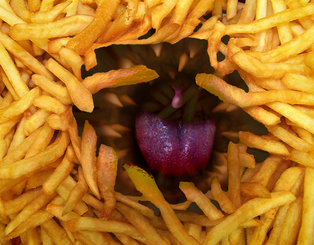
Assignment 18: Halloween Collection
|
|
|
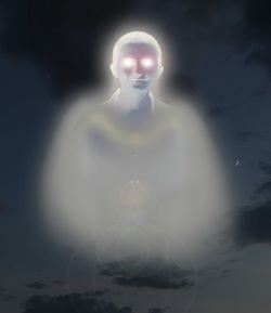
Just having some fun. I like monsterized food, so I made two. Also me as a ghost.
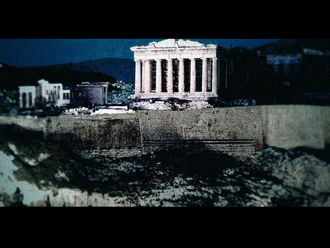
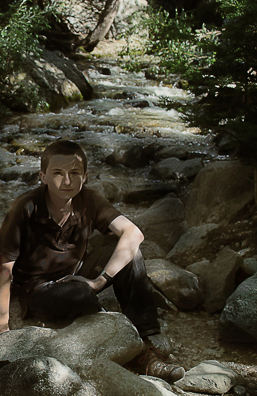
Assignment 19: 300 Movie Effect
|
|
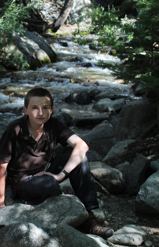
Looks cool, doesn't it? Before on the right, after on the left. Resembles the movie 300. The one on the bottom is me after wading through 500 yards of knee-deep freezing rapids (which you can see behind me...)
Assignment 20: Comic Strip (sort of)
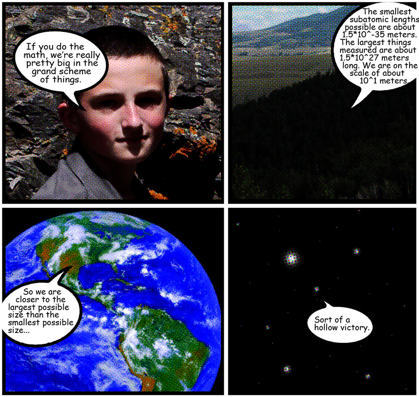
Bask in its glory.
